

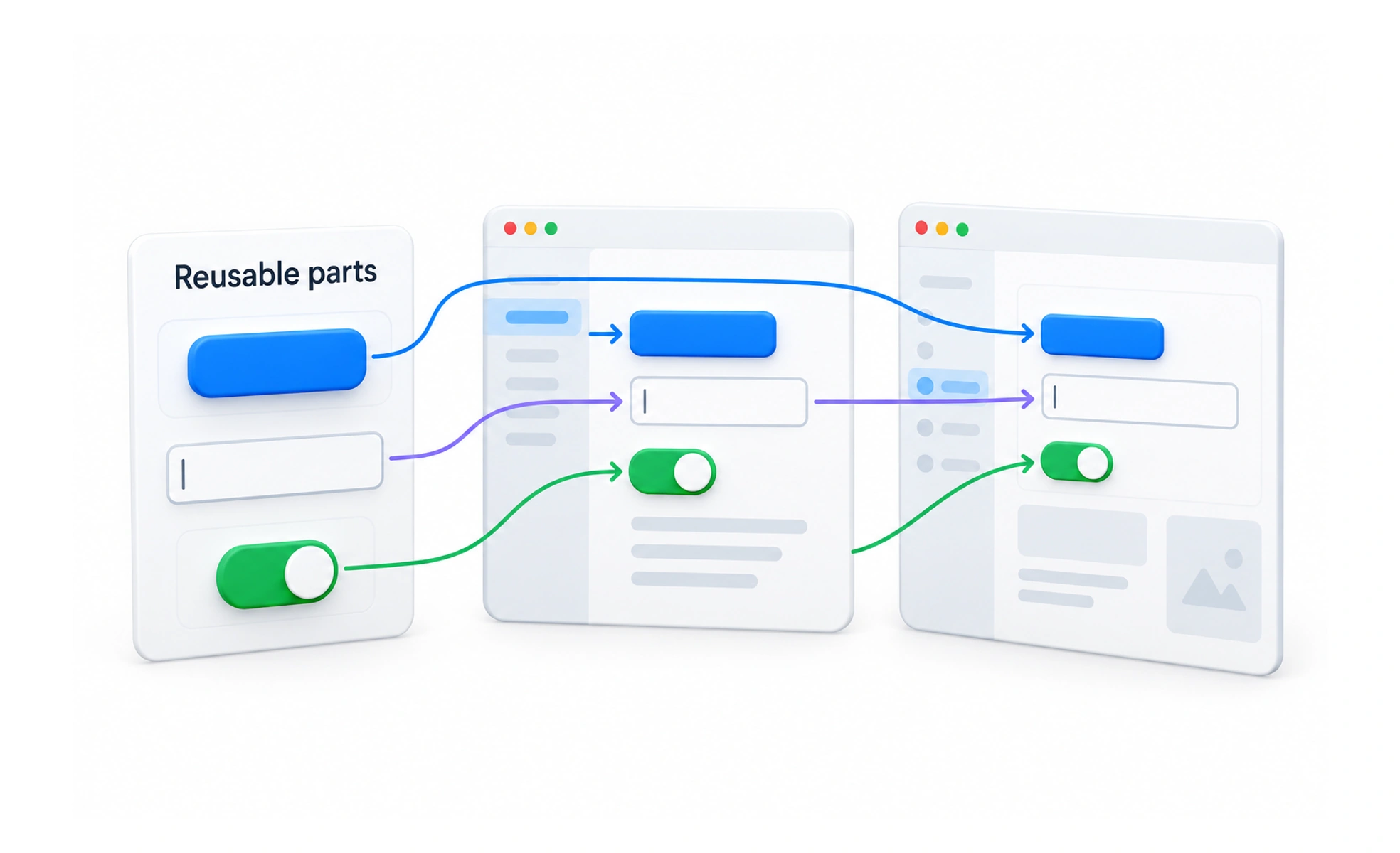
Behaving the same matters more than looking the same. A button component defines its hover, focus, disabled and loading behaviour once, so every use of it inherits the rules rather than reinventing them.
Think of it like this. Every light switch in a house works the same way. You do not study a new one in each room, and that is only true because someone standardised them.
Types
- Input. Text fields, checkboxes, radios, sliders, date pickers. These carry the heaviest accessibility burden, since they need real labels, meaningful errors and full keyboard operation.
- Output. Badges, progress indicators, tooltips, alerts, tables. Their job is communicating state without ambiguity.
- Navigation. Tabs, breadcrumbs, pagination, steppers. These answer where am I and where can I go.
- Container. Cards, modals, drawers, accordions. These usually own layout and reflow behaviour.
Real components often combine categories. A modal is a container that holds inputs and actions.
How it works
A component is reusable when it holds its own markup, styling and behaviour, and does not depend on the page around it.
It stays reusable when legitimate differences are handled by variants rather than by copying the file. If people fork a component to change one detail, it needed a variant.
The part most libraries get thin is state coverage. A button needs disabled, loading and focus states. A list needs empty, loading, error and partial. Products feel unfinished at exactly the states nobody specified.
Common mistakes
- Abstracting too early. The first use is a one off, the second might be coincidence, the third is a pattern. Components built for a use case that never arrives are harder to unwind than duplication.
- Shipping only the happy state. The empty and error states are where users actually notice quality.
- Fetching data inside the component. It becomes hard to reuse anywhere with different data and hard to test. Keep presentation fed by props.
Frequently asked questions
Key takeaways
- Specify every state, not just the resting one.
- Build accessibility into the component so consumers cannot forget it.
- If people fork a component to change one thing, it needed a variant.
- Wait for the third occurrence before abstracting.