

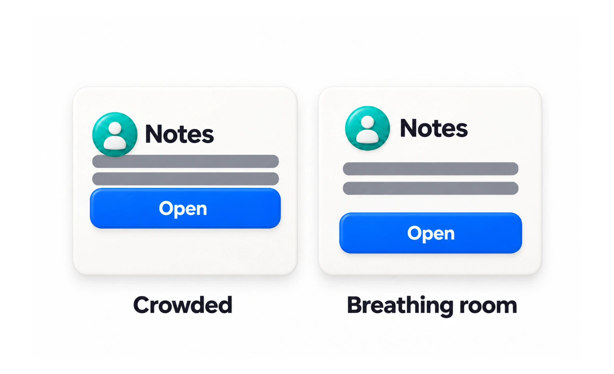
White space is the unoccupied space around and between interface elements. It helps people distinguish groups, follow content and focus on important information; it does not have to be white.
In a conversation, pauses give each idea room to land; white space plays a similar role in a layout.
Create breathing room with purpose
Space around a heading can signal the start of a new section, while a smaller gap between a label and its field shows they belong together. Use spacing to make hierarchy visible. Adding empty space without considering relationships can make the page feel scattered rather than calm.
Balance density and readability
A dashboard or data table may need a denser layout than a learning article. The goal is not to maximize empty area; it is to let people scan and act without losing context. Use grouping, alignment and typography together so compact content remains understandable.
Use space to guide attention
A primary action can stand out through placement and surrounding space, but it should not be isolated from the task it completes. Keep related supporting information close and place unrelated content farther away. Strong spacing can often clarify hierarchy without adding more borders or decorative backgrounds.
Example: an empty state
An empty state can use open space around one clear explanation and a relevant next action. Centering a tiny message in an enormous blank area may make it feel disconnected from the page. Keep its scale, position and action tied to the surrounding section and viewport.
Frequently asked questions
Key takeaways
- Space is a visual signal, not merely decoration.
- Keep related items close and distinct sections farther apart.
- Choose density based on the task and content.
- Use whitespace to clarify hierarchy and focus.