
10 Usability Heuristics
Learn Jakob Nielsen’s ten rules of thumb for spotting usability problems and how to review a design with them.
Heuristics are rules of thumb for spotting usability problems. The best known set comes from Jakob Nielsen, who published his ten heuristics in the 1990s. This lesson explains each one with an everyday example and shows how to use them to review a design.
Visibility of system status
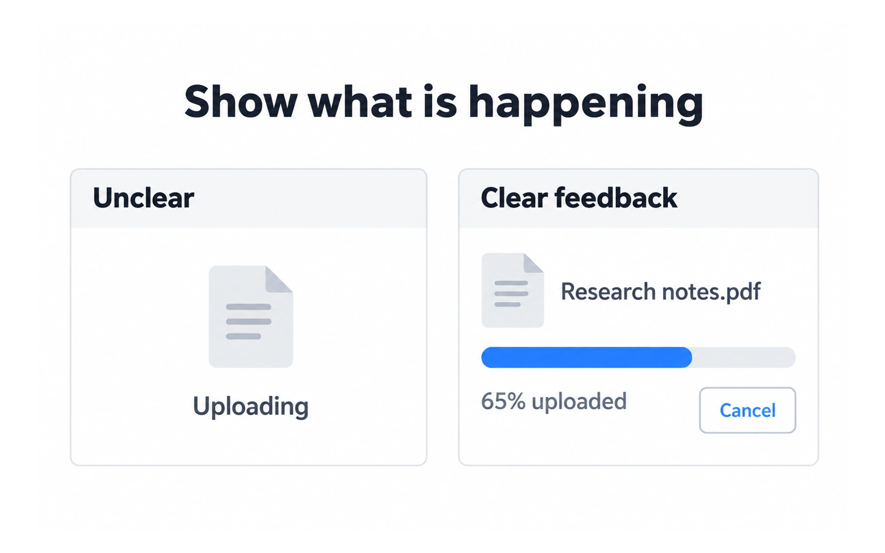
People should always know what the system is doing. In the example, the unclear version only says "Uploading", with no sign of progress or a way out.
The clear version names the file, shows a progress bar with "65% uploaded" and offers Cancel. People can see that the upload is working, how far along it is and what they can do.
Good feedback answers a few questions:
- What just happened?
- What is happening now?
- Where am I?
- What happens next?
Match the real world
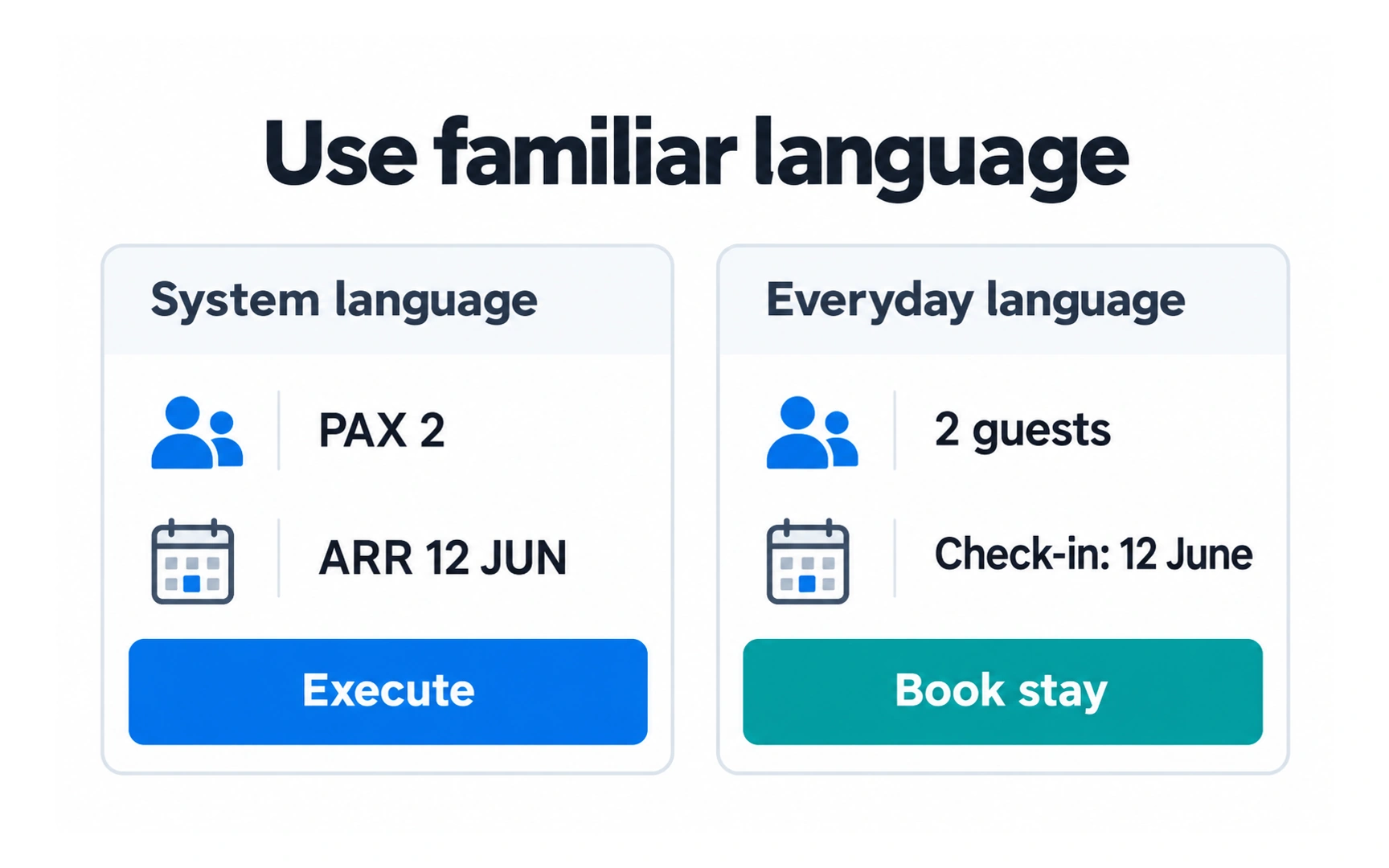
A product should speak its users’ language. In the example, the booking card uses system terms: "PAX 2", "ARR 12 JUN" and an "Execute" button.
The everyday version says "2 guests", "Check-in: 12 June" and "Book stay". Anyone can understand it without learning internal codes.
Use words and concepts your audience already knows. Specialist terms are fine when your users are specialists, such as doctors or lawyers, but test them first.
User control and freedom
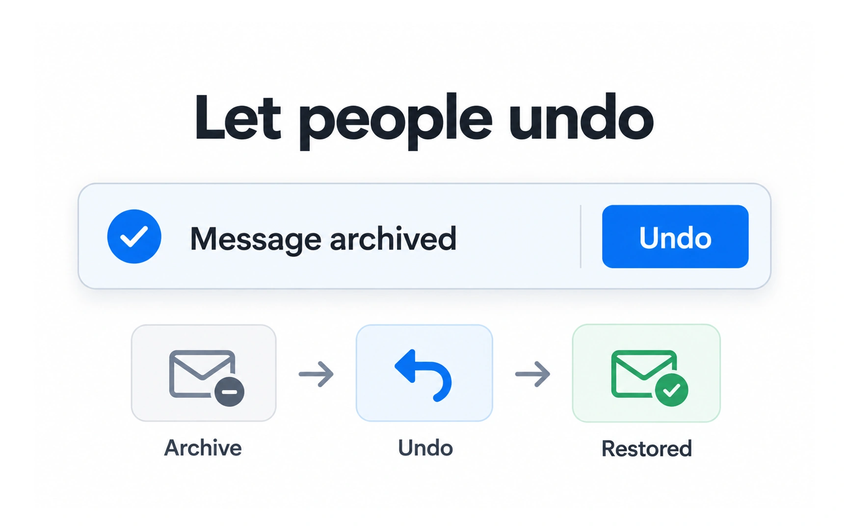
People make mistakes and change their minds. They need a clear way to back out. In the example, archiving a message shows a confirmation with an Undo button.
One tap restores the message. Because the action is easy to reverse, people can act quickly without worrying about getting it wrong.
Offer undo, cancel and back wherever you can, and label them clearly. Undo can also replace an "Are you sure?" dialog for actions that are easy to reverse.
Consistency and standards
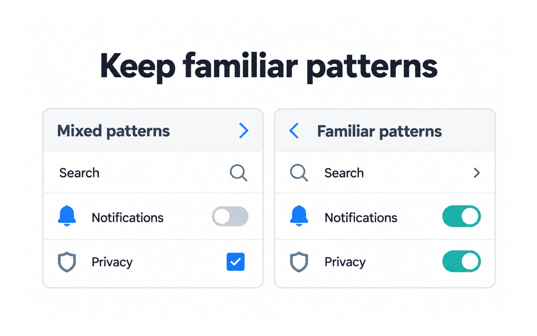
Things that do the same job should look and work the same way. In the "Mixed patterns" settings, one setting uses a toggle and the other a checkbox, and the icons and arrows sit in different places.
The "Familiar patterns" version uses a toggle for both on/off settings and places the icons, labels and arrows consistently. People learn the pattern once and reuse it.
Two kinds of consistency matter:
- Internal: the same patterns across your own product.
- External: following the conventions people know from other products and platforms.
Error prevention
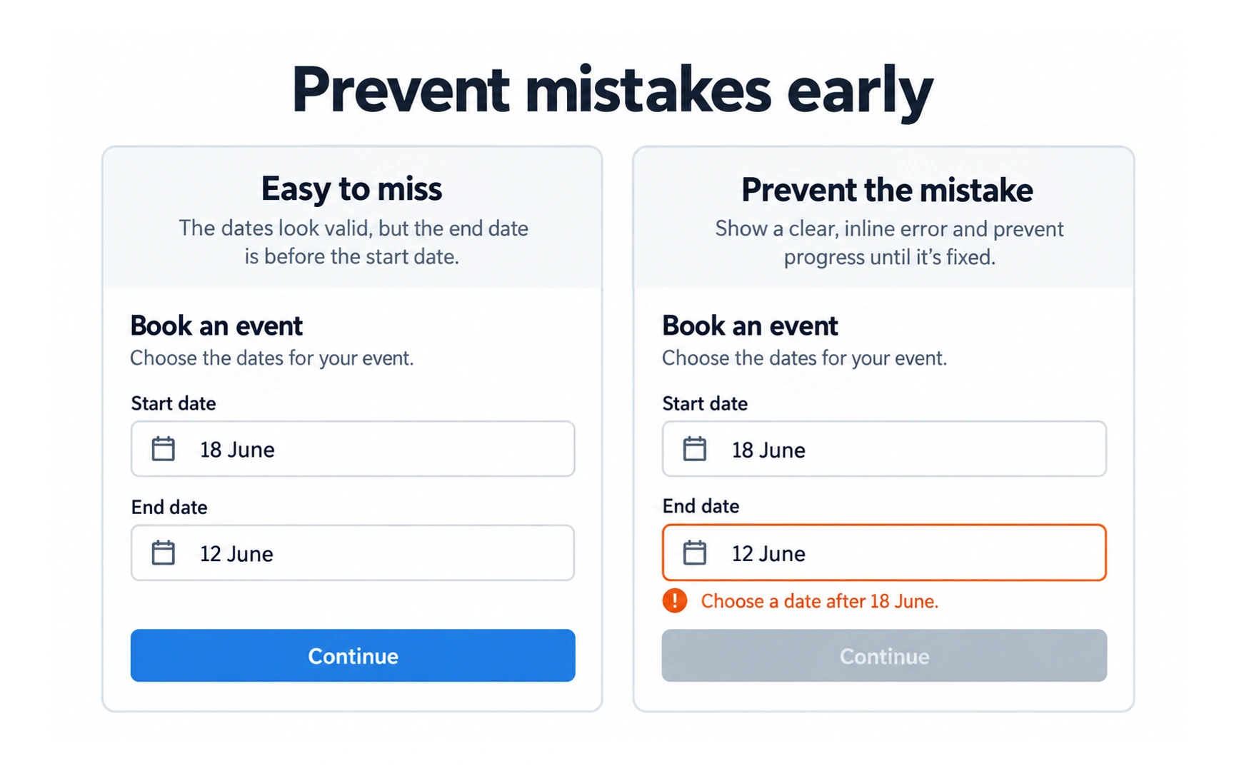
Preventing an error is better than explaining it afterwards. In the "Easy to miss" form, the end date is before the start date, but nothing warns the person.
In the other form, the field is highlighted, a message says "Choose a date after 18 June" and Continue is disabled until the problem is fixed.
Errors come in two kinds:
- Slips: people mean to do the right thing but do it wrong, such as a typo. Prevent them with constraints, suggestions and forgiving formats.
- Mistakes: people misunderstand how something works. Prevent them with clear labels and good defaults.
Recognition rather than recall
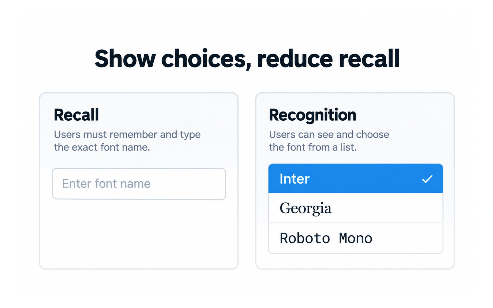
Seeing an option is easier than remembering it. In the example, the Recall field asks people to type the exact name of a font.
The Recognition version shows a list of fonts, each in its own style. People pick the one they want instead of remembering how it is spelled.
Keep useful options, recent items and instructions visible when they are needed, so people don’t have to remember them from one screen to the next.
Flexibility and efficiency
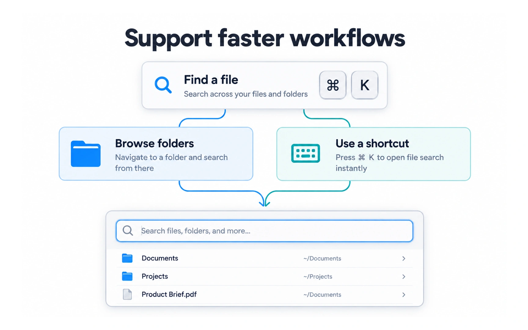
A good interface works for both newcomers and experienced users. In the example, there are two ways to find a file: browse the folders or press ⌘K to open search.
Newcomers can follow the visible path. Experienced users can take the shortcut and reach the same place faster.
Add accelerators, such as keyboard shortcuts, gestures and saved settings, without removing the simple path. Showing a shortcut next to its action helps people discover it.
Aesthetic and minimalist design
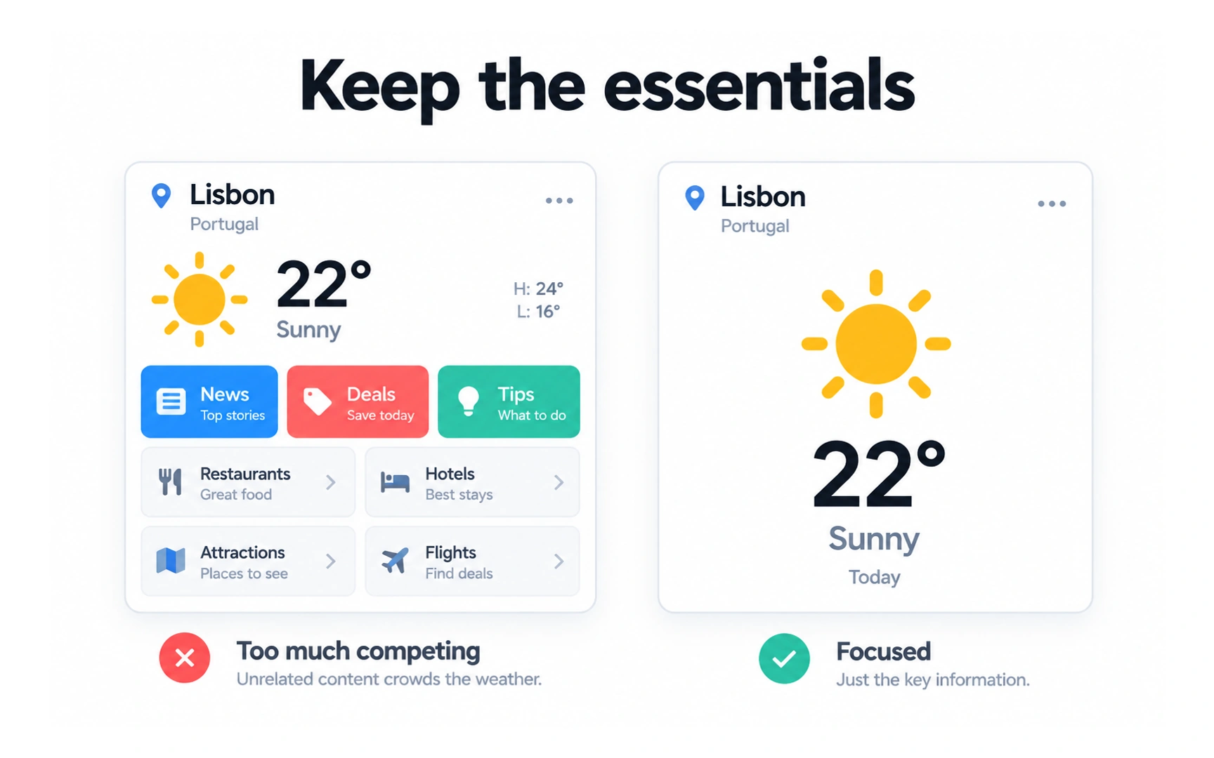
Every extra element competes with the ones that matter. In the "Too much competing" card, news, deals, tips and travel links crowd around the weather.
The "Focused" card shows only the place, temperature and condition. The key information stands out at a glance.
Minimalist does not mean empty. Remove what doesn’t help people with their task, and keep what they need.
Recover from errors
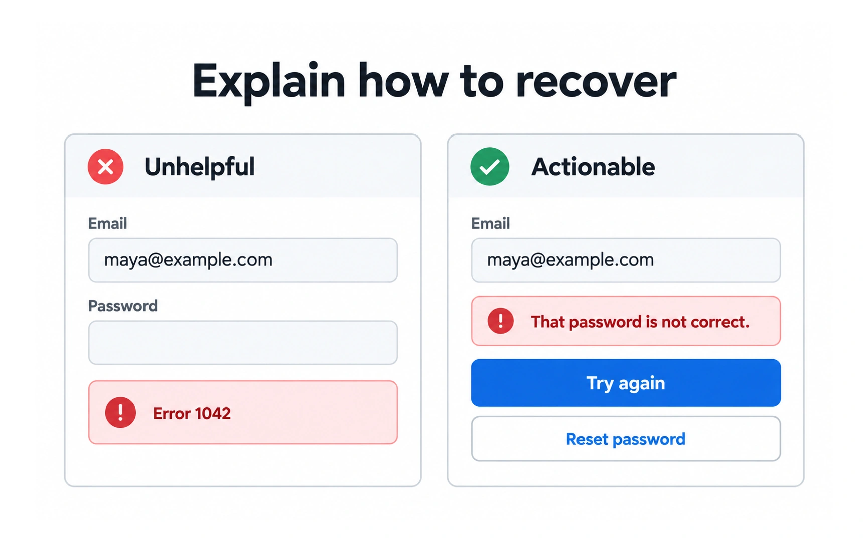
When something goes wrong, tell people what happened and how to fix it. In the example, the unhelpful form shows only "Error 1042".
The actionable form says "That password is not correct" and offers two ways forward: Try again or Reset password.
Good error messages use plain language, explain the problem and suggest a solution. Keep them polite, and never blame the person.
Help and documentation
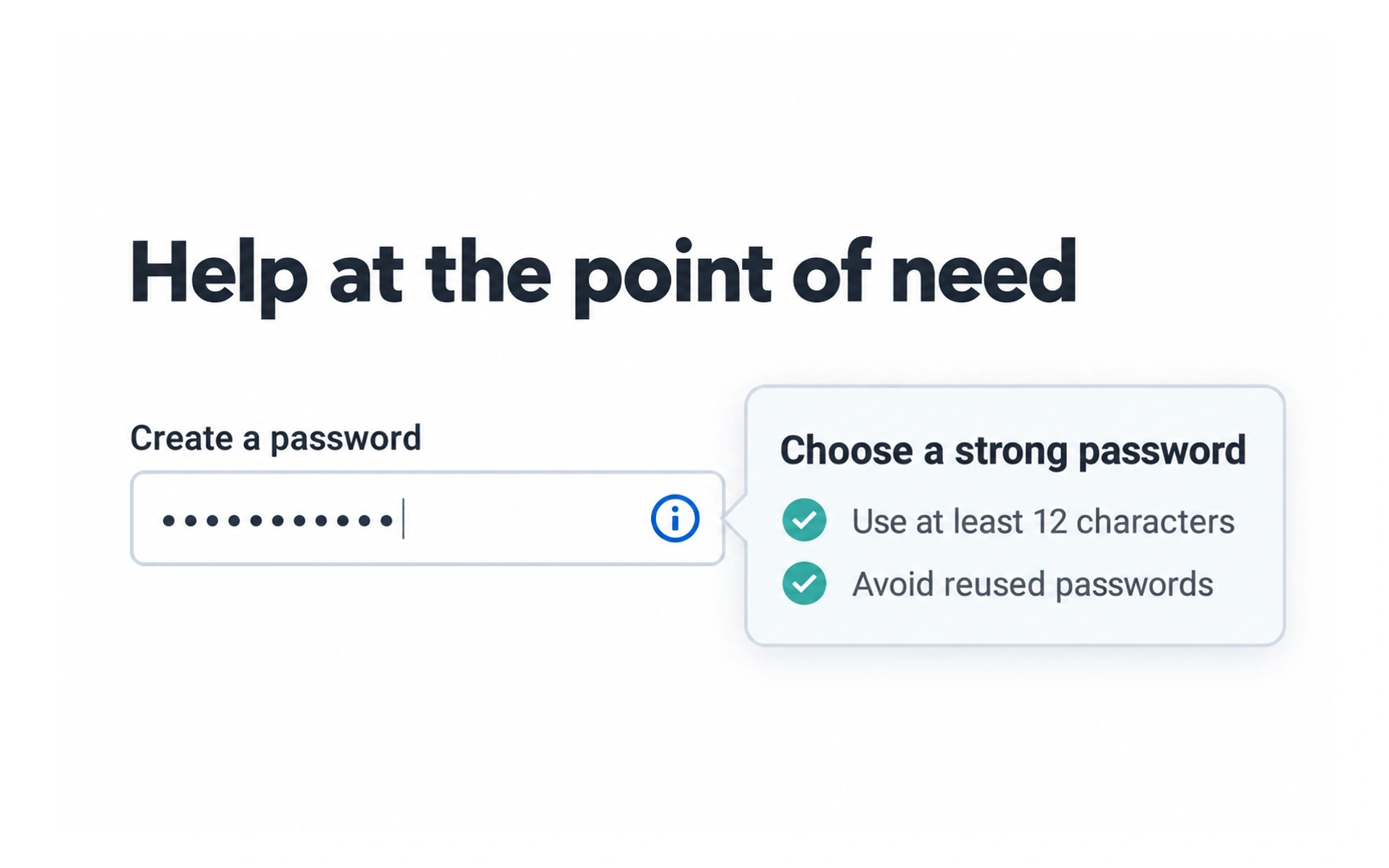
The best design needs little explanation, but sometimes people need help. In the example, an info icon next to the password field opens tips for choosing a strong password.
The help appears right where it is needed, at the moment the person is creating a password.
Keep help short and tied to the task. For bigger questions, make a help center or FAQ easy to find and search.
Running a heuristic evaluation
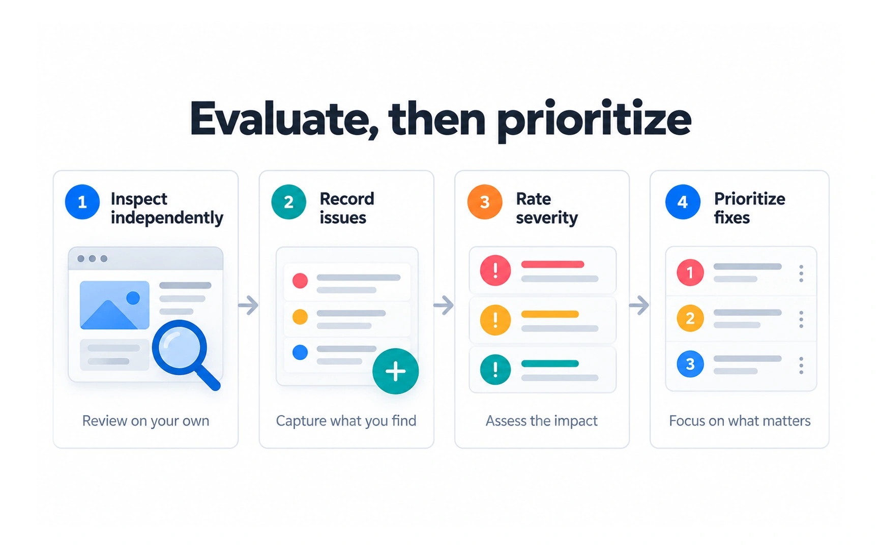
In a heuristic evaluation, a few reviewers check a design against a set of heuristics. The example shows four steps:
- Inspect independently: each reviewer checks the design on their own.
- Record issues: note each problem and the heuristic it breaks.
- Rate severity: judge each issue by its impact, how often it happens and how hard it is to work around.
- Prioritize fixes: combine everyone’s findings and fix the most serious issues first.
Nielsen’s ten heuristics are one popular set; others include Shneiderman’s Eight Golden Rules. Choose the set that fits your product.
A heuristic review is quick and cheap, but it does not replace testing with real users. Use it to find likely problems, then confirm them with research.
REFERENCES
TOPICS
FROM COURSE